[ Type ]
Branding
[ Description ]
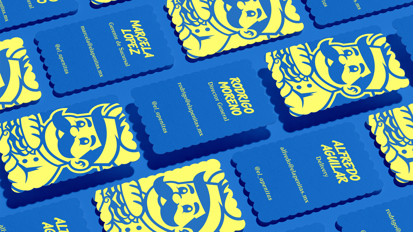
For El Apenitas, we crafted a brand that captures the spirit of the bustling Mexican market, full of flavor and personality. At its heart, a fun-loving mascot—a mustachioed chef—represents the playful side of Mexican street food culture, embodying the joy of biting into a juicy torta or burrito. The typography echoes this playfulness, balancing boldness and whimsy, ensuring the brand feels as vibrant as the food it serves. Every touchpoint is a celebration of flavor, humor, and the lively energy of Oaxaca’s culinary folklore.
El Apenitas screams local pride with a twist of modern flair. The bold yellow and blue color palette is a visual feast, grabbing attention while making the food the true hero. It’s not just branding—it’s an invitation to join a fun, mouth-watering journey where tortas and burritos reign supreme. We didn’t just create a brand; we brought a whole vibe to life, one that makes you smile before the first bite.
[ Map ]
Oaxaca MX
El Apenitas


